 I just spent an hour doing this post and it looked fine in the preview, and as you can see it is a mess. anybody know what I am doing wrong? I know it has to do with formatting and i don't know what I am doing wrong? I had pix on the left and right of each card and text inbetween and now it's all over the place. arrrrgh.
This months Byhand ATC swap spoke to me. This is the most fun I ever had making ATC's and while I feel sad to part with them I hope they give as much enjoyment to the recipients as I got creating them and, I can't wait to see what I will get.Shout out to the USPS.
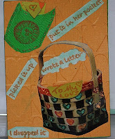
embossed with a cuttlebug folder
paper collage,cloth pocket
stardust pens
the letters come out of the pockets!


Chrysalis
Butterfly stamp Quietfire
--they come out---
embossed with a fiskers plate--they come out---
stardust pens
paper collage
ART ART ART

background is watercolor
on a silicon sheet and press
water color paper into it
removable card in back pocket


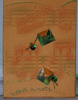
Leave a note
embossed with cuttlebug folder
paper collage pockets with note inside
embossed with cuttlebug folder
paper collage pockets with note inside


Carrots
versamark resist with pan pastels
removeable carrots in pockets
stickles
 I hope you enjoy viewing these and join in the next swap.
I'm learning something new everyday about creating these posts and am open to suggestions.
There must be some way to do this faster than I am doing it.
Please leave a comment.


7 comments:
Fun ATCs! I think Leave a Note is my fave, though it is hard to choose. Not sure what you wanted for formatting, but I did not find it hard to follow this. Maybe under Post Options you have something checked like "ignore new lines" or something? I am new at this blogging business so am not much help. Sorry!
I've had this problem amny times - it never looks the way you want it to look when you try to put text beside your photos. I've just resorted to photos,(large-centered) with text above or below, but not on the side. This works everytime. Perhaps someone more knowledgable with HTML can help, and I would be interested in the answer too!
thanks charmaine-leave a note is my fave too!
my SIL is a web designer and I'm hoping to get some help and answers from her. I'll keep you posted
Nice ATCs
Looks like you used the spacer to position your words "back" & "Front". Doesn't work the way you expect.
The main reason is because of viewing screens being different sizes and the text expands to accommodate that.
Another thing is when uploading your image, click on the position "NONE" rather than on left, right or center. That way you can really position your image and chose it's right, left or center option, using the text positioning button. Hope this helps.
Try altering the post you made by removing those "back" & "front" words and see what happens.
Just type normally. Position the image you're talking about at the start of each paragraph and the text will wrap around it.
Something else I should have mentioned.
When you click on an image on your blog, it becomes humungously big. You should probably make those smaller to begin with. My ATC images that I upload are usually around 300 x 215 pixels (you can change the size of your images in any photo editing program)
When uploading your pics, click on the smallest option and you should be able to get two images on the same line with text between. The images are still click-able to the larger version that you uploaded.
Great advice Yogi.
Thanks so much.
Onward and upward.
Post a Comment